Mobile-Friendly E-Commerce Store Redesign
Our responsive e-commerce store redesign boosted sales and search rankings for a watch accessory store.
Responsive e-commerce design is easy… or so they say. In reality, it’s easy to break a responsive website during the learning curve if you’re attempting to DIY. It’s easy to think it’s “almost all right” only to find out that page layouts won’t appear properly on various desktop, tablet and mobile phone screen sizes. That’s what was happening when our client called us. When they told us, “We’ve had enough with doing it ourselves, please fix it,” here’s how we delivered:
• Responsive code upgrade for responsive behavior
• Updated the Home page design to load more quickly on mobile devices
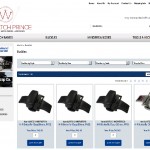
• The Category page was hard coded to display in a single-column layout. We converted it to display a three-column layout on desktop screen sizes.
• The old design was not able to display categories and sub-categories on the left-hand side of the website or on Category pages. We updated the code so that the Category Groups could be used for this purpose.
• We redesigned the appearance of the Category Filters
• We redesigned the Product Listing page layouts.
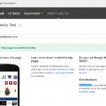
All of the re-coding and design changes were made in HTML 5 and CSS to pass the Google Mobile Friendly test with flying colors! With the e-commerce redesign and re-code, the watch store improved its search rankings for many of its target keywords and phrases. The store was redesigned on 3dCart which later became Shift4Shop, then moved to BigCommerce with a new, updated design.